Piv&Co is a federal chain of draught beer stores. It was included in the top 30 most profitable franchises in Russia for 2020 according to Forbes magazine.
Piv&Co offers draught beer from all over Russia and from its own brewery, more than 500 varieties of bottled beer from all over the world, snacks of its own production and goods for every day.


Task
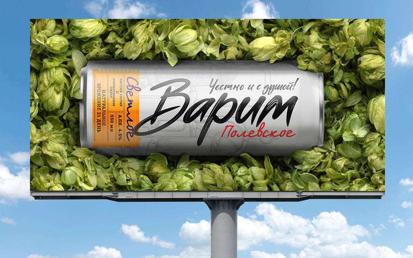
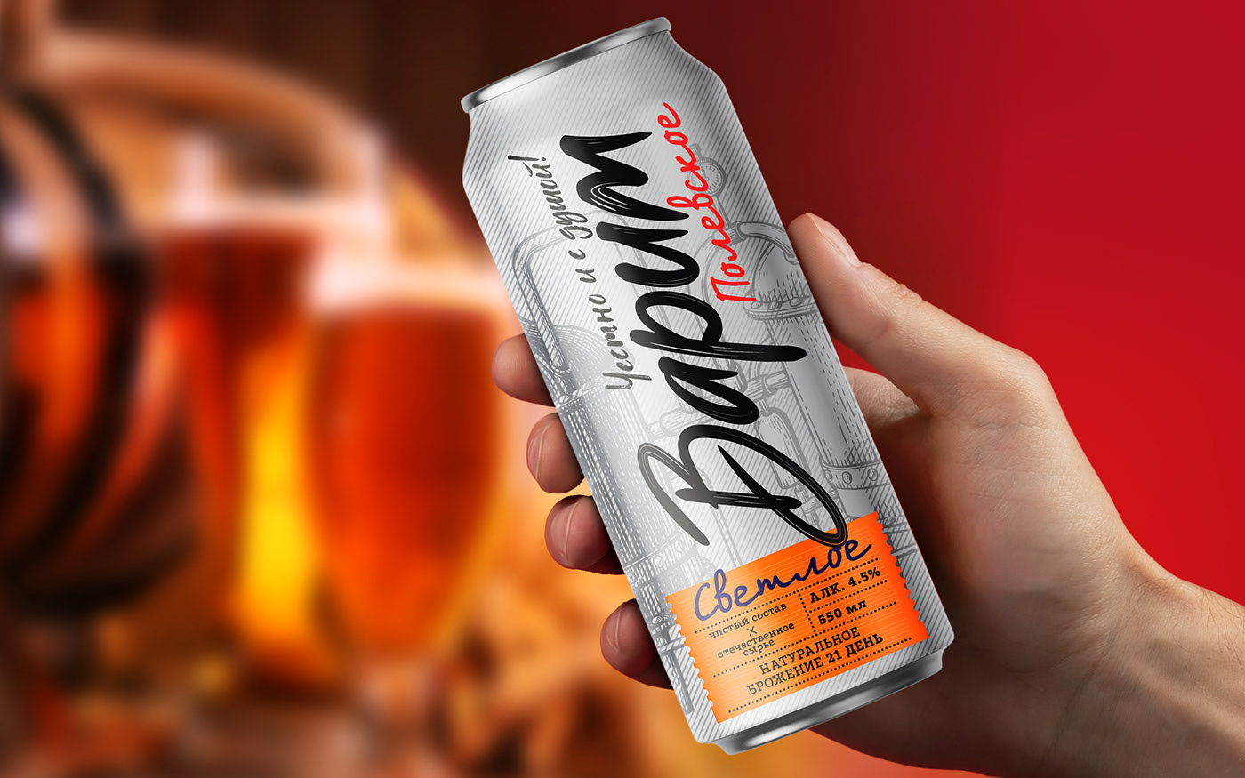
"Piv&Co" applied to us for the packaging design of a new brand "VARIM chestno y s dishoi". Getbrand's team of specialists had a task to highlight the new product among competitors with the help of effective visual communications, emphasizing the unique advantages of a domestic manufacturer of quality beer products.

Design is a strategically important contribution not only to the promotion of a brand, but also to its full development and prosperity. Visual communications act as a driver for increasing the speed of return on investment. That's why Getbrand, when approaching a task of any level of complexity, advocate the effectiveness of broadcasting the benefits of the product, as the packaging becomes a convincing argument to buy the product.
"Varim chestno y s dushoi" is a new brand of quality local beer, one of the advantages of which is domestic production. The translation of the main principles of the manufacturer is based on such key concepts as honesty and openness in dialog with the buyer, the use of high quality technologies, as well as transparency of the entire process of beer production.
With the help of the design we conveyed all the key advantages of "Varim chestno y s dushoi". The new brand look was developed as part of the "EXPRESS DESIGN" service and is a perfect example that the concepts of Inexpensive, FAST and QUALITY can become synonymous with each other, thanks to Getbrand. As a result, you get one effective design from the leading experts of our agency.
The resulting design sets the brand apart from its competitors. The drawn logo emphasizes the uniqueness of the domestic product. Such an expressive logo zone immediately attracts attention on the shelf.
Laconic architecture visually does not overload the consumer, but on the contrary - enhances the properties demonstrated on the packaging. For easy differentiation of regions different interesting dies with pleasant colors are used, which are accompanied by captions: "Tyumen, Kurgan", etc.
The developed design turned out to be effective: it highlights the brand and transmits its values.